
Building color selection
Page 4 of 4 •  1, 2, 3, 4
Re: Building color selection
![]() jeanmarlowe Sun Mar 29, 2009 4:49 pm
jeanmarlowe Sun Mar 29, 2009 4:49 pm
Admin wrote:What I can tell you is that we are taking this very seriously. We have asked and listened to opinions from residents. We have gone through several different iterations of colors and continue to evaluate more.
If you are considering different colors, might I suggest a truly neutral base, like a light taupe/grey? It gets away from the dark brown, whether red or yellow based, that is being suggested now. The upper part of the building and balconies could be painted the "oyster" or creams suggested. The grey would look nice with the slate colors of the water features and some drives, as well as compliment any color that the railings are painted. Pinn Brothers have a complex on Bascom & Campisi, called Onyx, that uses the same hues as we do plus grey and I think it looks very nice. It's a little different than the greys used at Rivermark, which are more green based.
jeanmarlowe- Posts : 62
Join date : 2008-04-24 -

Boy am I color confused...
![]() AlexB Sun Mar 29, 2009 5:05 pm
AlexB Sun Mar 29, 2009 5:05 pm
Here is a snip from that thread:
"The original color of the canopies were more blue than green, but was in keeping with the Corsican look. Here is a traditional blue door in the pink wall: http://www.istockphoto.com/file_closeup/architecture-and-buildings/architectural-detail/707690-blue-door.php?id=707690
...
You can see the original look of Villagio here: http://www.mve-architects.com/portfolio/pr/160_Villagio-at-River-Oaks"
I suggest people go look at that, if they haven't, since it does seem to be what we would be talking about when we say 'original', not the more teal/faded green color we have now.
I was originally thinking I'd like an updated look, but I have to say the bluer awning look with the pinkish look really does stand out nicely. I don't see that in any of the paint samples, but perhaps the painters have not seen what it originally looked like? I also like some of the recent suggestions, but I assume the board and committee will sift through it all in time.
As for those who just want a decision to be made, we do have to make sure the rainy season has stopped anyway, and I think we'd want to make sure the deck re-finishing is done first, right? The latter is in case some minor repairs need to be done, as one poster already pointed out. I guess we don't have much time left, though.
Alex
P.S. For full disclosure, I am clearly one of those that the real estate person's posts are talking about, as I was impressed by the color scheme, the brightness, and the difference between Villagio and all the other 'brownish' complexes. Even though I do have some unknown anti-teal childhood bad experience lurking in me somewhere, and don't even get me started on orange and lime green - I can still see that clothing display from 10 years ago that freaked me out...recovery takes time...
If we are going to talk about other complexes, I think we should be looking across River Oak at the older complex there more than a rental place like Elan, even if it is more interesting to look at than it used to be. The place (can't remember the name at the moment) looks way, way nicer than when I looked at them last year, even if they do still kind of remind me of boxy WWII military housing from the prairies...just as an example of what can be done with a simple paint job, not as an example of the exact colors or paint scheme to pick.
alexb
Posts: 2
Join date: 2008-06-13
AlexB- Posts : 7
Join date : 2008-06-13
Re: Building color selection
![]() Admin Sun Mar 29, 2009 8:48 pm
Admin Sun Mar 29, 2009 8:48 pm
Thanks for the suggestion. I'll bring it up to the consultant and see what she thinks.
Take care!

Admin- Admin
- Posts : 685
Join date : 2008-04-02
Location : Building #475 -
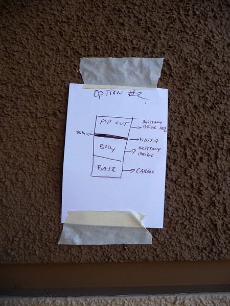
Color test on photo
![]() mickyni Tue Mar 31, 2009 1:35 am
mickyni Tue Mar 31, 2009 1:35 am
mickyni- Posts : 22
Join date : 2009-03-31
Re: Building color selection
![]() Admin Tue Mar 31, 2009 1:38 am
Admin Tue Mar 31, 2009 1:38 am
mickyni wrote:I truly think we should use " Photoshop" or other software to test out the color from photo first. Sometimes color may looks good on A but not B , so I would suggest we should let home owner look at possible building color on photo then doing mail voting or during board meeting.
Do you have the photoshop skills to do it?
Admin- Admin
- Posts : 685
Join date : 2008-04-02
Location : Building #475 -
Re: Building color selection
![]() mickyni Tue Mar 31, 2009 2:12 am
mickyni Tue Mar 31, 2009 2:12 am
Do you have the photoshop skills to do it?
Yes , I do
mickyni- Posts : 22
Join date : 2009-03-31
Re: Building color selection
![]() Admin Tue Mar 31, 2009 2:16 am
Admin Tue Mar 31, 2009 2:16 am
mickyni wrote:Do you have the photoshop skills to do it?
Yes , I do
Great!
Can you use these colors in this picture and place them on the building photo?
Admin- Admin
- Posts : 685
Join date : 2008-04-02
Location : Building #475 -
Re: Building color selection
![]() Admin Tue Mar 31, 2009 3:18 am
Admin Tue Mar 31, 2009 3:18 am
thanks for the help!
Admin- Admin
- Posts : 685
Join date : 2008-04-02
Location : Building #475 -
Re: Building color selection
![]() Admin Wed Apr 01, 2009 12:12 pm
Admin Wed Apr 01, 2009 12:12 pm
It was a difficult decision but I think everyone will be happy.
Admin- Admin
- Posts : 685
Join date : 2008-04-02
Location : Building #475 -
Re: Building color selection
![]() Admin Thu Apr 02, 2009 2:30 am
Admin Thu Apr 02, 2009 2:30 am
Admin wrote:The board met with our color consultant yesterday and after about an hour of discussions we've decided on the colors! It's a compromise between Corsican and Tuscan with a splash of modern. Buildings will be painted in alternate colors. So one building will be painted with the current colors (Pink/teal) and the next building will be painted Tuscan with modern warmer tones. The buildings will be tied together with accents in black like the doors and garages.
It was a difficult decision but I think everyone will be happy.
Happy April fools!
Admin- Admin
- Posts : 685
Join date : 2008-04-02
Location : Building #475 -
Re: Building color selection
![]() terrychr Thu Apr 02, 2009 11:45 am
terrychr Thu Apr 02, 2009 11:45 am
terrychr- Posts : 42
Join date : 2008-04-25
Admin- Admin
- Posts : 685
Join date : 2008-04-02
Location : Building #475 -
Re: Building color selection
![]() stuttgart Tue Apr 07, 2009 3:22 am
stuttgart Tue Apr 07, 2009 3:22 am
http://picasaweb.google.com/lh/photo/jQ7GeryH0gW9lvVt4ewD1w?feat=directlink
BTW does the re painting cost the owner any money out of the pocket?

stuttgart- Posts : 30
Join date : 2008-12-16
Admin- Admin
- Posts : 685
Join date : 2008-04-02
Location : Building #475 -
Re: Building color selection
![]() jeanmarlowe Tue Apr 07, 2009 12:52 pm
jeanmarlowe Tue Apr 07, 2009 12:52 pm
stuttgart wrote:I prefer this color.
http://picasaweb.google.com/lh/photo/jQ7GeryH0gW9lvVt4ewD1w?feat=directlink
I agree with stuttgart. It's bright, cheery and clean looking. Consider a day like today, when it is raining - our place still looks bright and cheery, if a little bit dirty. The new paint colors currently up don't look so bright.
Also as seen on another thread:
If you have time, take a look at the Sycamore complex at North Park - (http://www.rental-living.com/Northpark.aspx) - the cream is nice and bright and the grey base is very nice and the whole effect is very clean looking. It's even better looking in person, but still looks good in the link.
jeanmarlowe- Posts : 62
Join date : 2008-04-24 -
Re: Building color selection
![]() H. Tue Apr 14, 2009 12:53 am
H. Tue Apr 14, 2009 12:53 am
Helen Woodson wrote:
On a separate topic. Did you see the complaint about your flower pots? Could you please remove them from the courtyard?
Hi, Tom,
I'm afraid not, and I almost didn't see this. I'm so busy these days that I don't even look at this forum very often; I just barely scan through the posts on topics that catch my eye. Who's complaining now?
If the mystery complainant has any more issues in the pipeline, they'd best bring it up now or forever hold their bleeping peace. I'd like to get any further matters resolved ASAP so that I can be left in peace.
Please do not hesitate to contact me personally about anything urgent.
Anyway, I've got all that stuff back where it belongs. I apologize for not getting it done sooner; it wasn't for lack of wanting to. I've got some limitations due to a bad back, so I had to bring things up a little at a time and had to get help for the larger pieces. So now I'm having fun replanting my herb garden. Most of them are annuals, so I have to start over every spring. But it's worth it! Mmmm, fresh basil!
Helen
H.- Posts : 78
Join date : 2009-02-25
Re: Building color selection
![]() bm455 Thu Apr 16, 2009 12:02 am
bm455 Thu Apr 16, 2009 12:02 am
However, I don't agree with the comments about changing color will "upgrade" the appeal from a 90's building. Actually, I think the changing the color to these "brown" or neutral colors will make the building look sad and with no style... just like the building accross the street
I understand that there are MANY oppinions and people will not be pleased. That's why we should VOTE but in a formal setting (not through this forum). Or tell people to attend the HOA meeting (x day) and cast a vote. Whoever is interested will have to go.
It seems to me that the decision is made to change colors (away from the current one) and you are trying to find a better color choice. I have read all the replies in this forum and it seems the majority (includying myself) do not want to change the color. Not because we LOVE the pink/teal option but because is a LOT better that the brown ones.
Again, I suggest to mail a note to every single condo owner and notify an appt. for a HOA meeting so we can vote for the paint color. People must attend to cast their vote.
Thanks again.
Blanca.
bm455- Posts : 2
Join date : 2009-02-25
Re: Building color selection
![]() nardin Thu Apr 16, 2009 1:10 am
nardin Thu Apr 16, 2009 1:10 am
bm455 wrote:The colors look better that the previous suggestions. Thanks.
However, I don't agree with the comments about changing color will "upgrade" the appeal from a 90's building. Actually, I think the changing the color to these "brown" or neutral colors will make the building look sad and with no style... just like the building accross the street
I understand that there are MANY oppinions and people will not be pleased. That's why we should VOTE but in a formal setting (not through this forum). Or tell people to attend the HOA meeting (x day) and cast a vote. Whoever is interested will have to go.
It seems to me that the decision is made to change colors (away from the current one) and you are trying to find a better color choice. I have read all the replies in this forum and it seems the majority (includying myself) do not want to change the color. Not because we LOVE the pink/teal option but because is a LOT better that the brown ones.
Again, I suggest to mail a note to every single condo owner and notify an appt. for a HOA meeting so we can vote for the paint color. People must attend to cast their vote.
Thanks again.
Blanca.
I disagree, we elected the board to do the job of making these types of decisions. I doubt that every homeowner will take this decision as seriously as the board or painting committee.
nardin- Posts : 10
Join date : 2009-02-27
Re: Building color selection
![]() amun Thu Apr 16, 2009 1:25 am
amun Thu Apr 16, 2009 1:25 am
amun- Posts : 5
Join date : 2009-04-08
keep the original colors with a twist
![]() marcelleqb Thu Apr 16, 2009 4:03 pm
marcelleqb Thu Apr 16, 2009 4:03 pm
The colors currently chosen are bland and the accent colors are terrible and show a lack of sophistication that this complex deserves. These new colors are going to drag down our home values for sure. No new home builder would choose these horrible colors.
Bad, bad decision.
marcelleqb- Posts : 13
Join date : 2009-04-07
Re: Building color selection
![]() JBrowning Thu Apr 16, 2009 6:45 pm
JBrowning Thu Apr 16, 2009 6:45 pm
marcelleqb wrote:I personally do not think that the board should be making the decision to change the entire color scheme of the buildings. I don't mind a tweak here and there - the awnings, railings and the bottom level color.
The colors currently chosen are bland and the accent colors are terrible and show a lack of sophistication that this complex deserves. These new colors are going to drag down our home values for sure. No new home builder would choose these horrible colors.
Bad, bad decision.
Just another opinion but it looks like the majority disagrees with you.
JBrowning- Posts : 15
Join date : 2009-02-27
Re: Building color selection
![]() marcelleqb Thu Apr 16, 2009 8:09 pm
marcelleqb Thu Apr 16, 2009 8:09 pm
A majority? 14 to 13 is a very slim majority.
Yes, it is an opinion. Isn't that what this board is for?
I would like to clarify one thing. When I said "bad, bad decision" I did not mean to sound so harsh. That is a problem with posting - no voice inflection allowed. It was said more with regret that the board is having to make this decision than to imply that the board is making bad decisions. Mea culpa and I apologize for my poor choice of words.
Last edited by marcelleqb on Thu Apr 16, 2009 8:35 pm; edited 1 time in total
marcelleqb- Posts : 13
Join date : 2009-04-07
Re: Building color selection
![]() Admin Thu Apr 16, 2009 8:18 pm
Admin Thu Apr 16, 2009 8:18 pm
bm455 wrote:The colors look better that the previous suggestions. Thanks.
However, I don't agree with the comments about changing color will "upgrade" the appeal from a 90's building. Actually, I think the changing the color to these "brown" or neutral colors will make the building look sad and with no style... just like the building accross the street
I understand that there are MANY oppinions and people will not be pleased. That's why we should VOTE but in a formal setting (not through this forum). Or tell people to attend the HOA meeting (x day) and cast a vote. Whoever is interested will have to go.
It seems to me that the decision is made to change colors (away from the current one) and you are trying to find a better color choice. I have read all the replies in this forum and it seems the majority (includying myself) do not want to change the color. Not because we LOVE the pink/teal option but because is a LOT better that the brown ones.
Again, I suggest to mail a note to every single condo owner and notify an appt. for a HOA meeting so we can vote for the paint color. People must attend to cast their vote.
Thanks again.
Blanca.
Hi Bianca,
Thanks for the feedback! I'll mention it to the rest of the board members.
A couple of thoughts from me.
No final decision has been made regarding the colors. From what I can gather the majority does want to change the colors. Some may not like the dark browns (which we scraped based on the response from the polls - yes we are listening), others don't like the lighter shades (that is currently up) but from what was voted in a previous poll it seems the majority wanted a change.
We do have a meeting tonight, so I'll post an update tonight or tomorrow.
Admin- Admin
- Posts : 685
Join date : 2008-04-02
Location : Building #475 -
Re: Building color selection
![]() H. Wed Apr 22, 2009 3:47 pm
H. Wed Apr 22, 2009 3:47 pm
It was sad, but at least they left the house white rather than painting it avocado green or harvest gold or pumpkin orange <shudder>, colors which were the latest rage for everything from clothes to appliances to carpet.
It's hard to change the design after it's realized.
Fast forward to the Villagio color discussion.
Villagio was designed to evoke an Italian villa, with sun-drenched colors, fountains, and greenery for a feel of gracious living. If we try to change that basic design, it's going to clash just like replacing flowered wallpaper with sheet paneling in a Victorian house.
I think the characteristic that's distinctive of the Italian look what's called (I think) the *value* of the colors, which is achieved by taking either a clear primary color (red, blue, or yellow) or a secondary color (violet, green, or orange) and mixing it with enough white to get a soft pastel. Brighter (but still clear primary or secondary) colors are used for the accents. The earth colors are achieved by mixing all three primary colors in different proportions, or by mixing in some black for a darker tone. You can mix in all the white you want with these, but it won't change the basic feel of the color.
Using the earth tones will clash with the design (as well as clashing with the roofs and cobblestones).
I love the original colors (as everyone knows), but I'd be okay with some other sun-drenched color.
Or - remember Tom's April Fool's joke about painting the complex different colors? Seriously, we could do that with a rainbow of sunny colors, either painting different units different colors, or painting each building a different color scheme - kind of like what you see in San Francisco, with houses of different pastels next to each other (only I'd lose the black doors!) I think this would be a sunny, happy look also. It would go with the fountains, reflecting pools, and ducks.
Imagine a pale, clear yellow rather than the mustard yellow we've seen, with blue or green accents. Or lavender with deep rose or blue accents. Or (dare I say it?) pink and teal. Or.... you get the picture. Maybe all of these.
Would it be possible to have some samples done like this? It wouldn't have to be ground-to-roof or even very wide.
Let's consider staying with something that's compatible with the Villagio complex and what makes it distinctive. We don't need to look like Elan or anyone else - those looks are a dime a dozen and don't get a second look.
Helen, who's no expert but knows what makes her smile
H.- Posts : 78
Join date : 2009-02-25
Re: Building color selection
![]() H. Thu Apr 23, 2009 4:10 pm
H. Thu Apr 23, 2009 4:10 pm
bm455 wrote:The colors look better that the previous suggestions. Thanks.
However, I don't agree with the comments about changing color will "upgrade" the appeal from a 90's building. Actually, I think the changing the color to these "brown" or neutral colors will make the building look sad and with no style... just like the building accross the street
I understand that there are MANY oppinions and people will not be pleased. That's why we should VOTE but in a formal setting (not through this forum). Or tell people to attend the HOA meeting (x day) and cast a vote. Whoever is interested will have to go.
It seems to me that the decision is made to change colors (away from the current one) and you are trying to find a better color choice. I have read all the replies in this forum and it seems the majority (includying myself) do not want to change the color. Not because we LOVE the pink/teal option but because is a LOT better that the brown ones.
Again, I suggest to mail a note to every single condo owner and notify an appt. for a HOA meeting so we can vote for the paint color. People must attend to cast their vote.
Thanks again.
Blanca.
I couldn't agree with you more! The external colors are something we all will have to live with for the next ten years, if we like them or not. Something that affects us all so much and for so long should, I think, be put to a vote by the homeowners - perhaps in the annual meeting next month. Many of us did not know the date of this month's meeting, as it wasn't announced or noticed, and it wouldn't hurt at all to have this as an agenda item in the annual meeting. I am not sure, but I think there is a way to vote absentee on the annual meeting items.
I keep reading how the majority wants a change, but the poll indicates that only 20% want a major change. 78% voted to return to the original colors or stay with some flavor of the current colors - but all we see is brown, tan, mustard, etc. There was a rosy brown that was supposed to be an update of the current colors, but it didn't resemble the current colors at all.
Helen
H.- Posts : 78
Join date : 2009-02-25
Page 4 of 4 • 1, 2, 3, 4
» New building color options
» New color choices for building painting - includes new poll
» HALLWAY PAINT ACCENT COLOR ?????
» Deck Refinishing Schedule
|
|
|