
Building color selection
Page 2 of 4 •  1, 2, 3, 4
 ![]()
please keep the original colors
![]() john Sat Feb 21, 2009 11:55 pm
john Sat Feb 21, 2009 11:55 pm
So fellow Village residents, let's keep our Italian oasis alive!!!
My 2 cents worth.
- John
john- Posts : 19
Join date : 2009-02-21
Please keep orginal clorors
![]() terry Sun Feb 22, 2009 3:30 pm
terry Sun Feb 22, 2009 3:30 pm
terry- Posts : 12
Join date : 2008-08-02
Re: Building color selection
![]() Admin Mon Feb 23, 2009 12:56 pm
Admin Mon Feb 23, 2009 12:56 pm
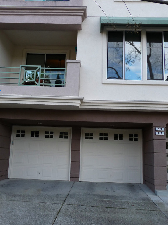
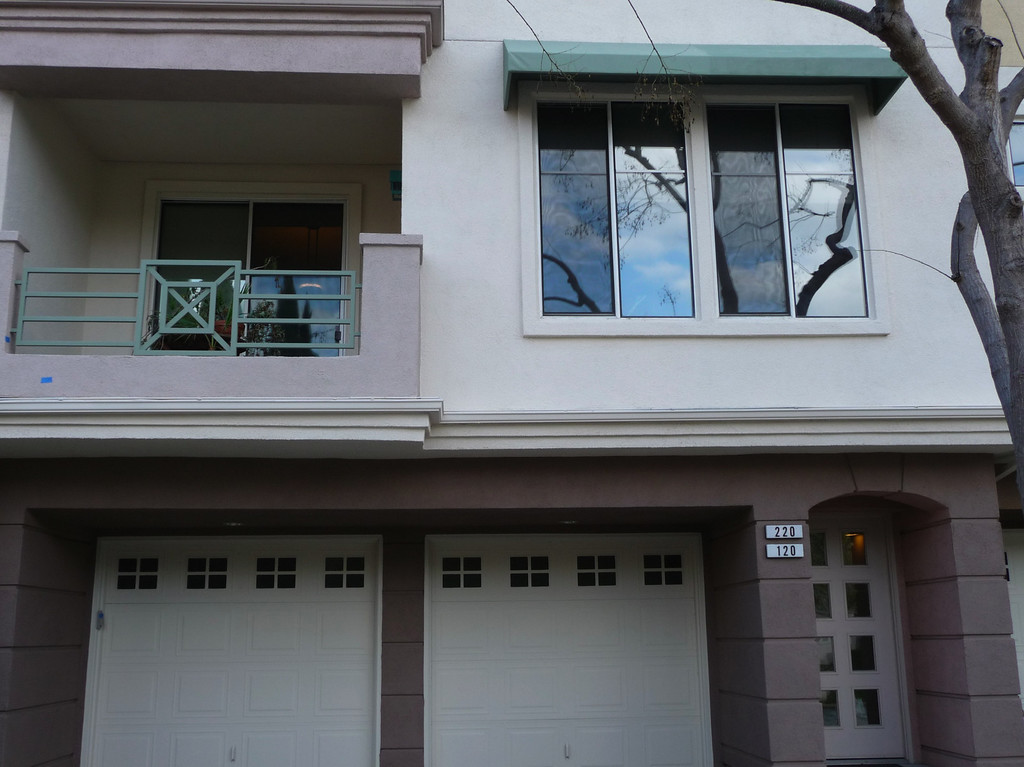
Late last week the painter (Ekim) tried another combination of colors. I was away this weekend and haven't taken a close look but I'll take some pictures today.

Admin- Admin
- Posts : 685
Join date : 2008-04-02
Location : Building #475 -

For the Board and color committe (Jerry)
![]() Italia Mon Feb 23, 2009 6:24 pm
Italia Mon Feb 23, 2009 6:24 pm
I think the end corner unit with toned down pale gold and brown accents looks fantastic. If not too late I would LOVE to be on the color committee as not only an artist but as a graphic design manager for over 13 years. I know a lot about color and composition as that is a very big part of my job.
The board is elected by the homeowners to make these types of decisons and the fact there is a color committee further demonstrates the decision should NOT be opened up to the entire homeowner group for a vote. That is not how HOA's are run for very good reason. If we are to make a timely final decision and get the painting started soon, I sincerely hope the board and color committee will be the ones to make the final decision so we don't end up with a long drawn out conflict delaying the paint job. You can't make everyone happy.
I don't think the new option of repainting the place the same very outdated colors or even one of those colors is a good idea, in fact it is so outdated, it would bring DOWN the value of our property in my opinion.
I learned that using the same base color as one example was due to just 3 non-board members asking for it. THis is what I mean by opening it up and causing a delay. I would not recommend any further color examples as this could go on indefinatley. Hopefully those in charge of the decision - the color team will make the correct decision and soon. From what I have heard in walking most days around the comples for exercise has been very positive for the end corner unit color combo of pale gold and browns.
Respectfully
Deborah Hill
475 Milan
#121
Italia- Posts : 43
Join date : 2009-02-05
Teal awnings should NOT be the determining factor for an updated color scheme
![]() Italia Mon Feb 23, 2009 6:35 pm
Italia Mon Feb 23, 2009 6:35 pm
Since they are purely decorative and do not provide any privacy whatsoever, replacement would likely be too costly and since they will not go with a new more earth toned updated color scheme I would think taking them down would be a decent compromise. I doubt we can afford new ones within a new color scheme. The awnings should NOT be the determining factor in our new more current color scheme.
Regards,
Deborah
Italia- Posts : 43
Join date : 2009-02-05
AWNINGS
![]() bradham Mon Feb 23, 2009 8:14 pm
bradham Mon Feb 23, 2009 8:14 pm
I am NOT the only OWNER, who wants them to remain. Thanks..
bradham- Posts : 14
Join date : 2008-04-24
Age : 58
Re: Building color selection
![]() Admin Mon Feb 23, 2009 8:33 pm
Admin Mon Feb 23, 2009 8:33 pm
There are 3 ways we can handle the awnings.
1. Remove and discard them - Ekim can do this. It would involve patching the holes left behind. An inexpensive option with no potential issues down the road. However, I understand some residents won't be happy.
2. Paint the current awnings - This process means that the awnings would be painted without taking them off and would not cost additional $. However, the paint color will fade quicker than the buildings. Villagio has a plan to repaint every 10 years I believe. Ekim does not think that the paint on the awnings will last longer than 5 years (It will begin to fade and dull). How good or bad they will look in 5 years is anyone's guess. If we paint it now and decide to remove it 5 years from now because the color has faded too much there will/may be tan paint behind the awning that is visible. Which will need to be addressed and will cost $. Another option may be to repaint them in 5 years, which will cost $.
3. Reupholster the awnings - This would entail removing the frames letting the painters paint behind the frames. While another vendor reupholsters the awning with new cloth. This is the most expensive option but still possible. The awning will last longer than painting. The final cost is still TBD.
Just more information for all to noodle on...
Admin- Admin
- Posts : 685
Join date : 2008-04-02
Location : Building #475 -
Re: Building color selection
![]() sswillow Tue Feb 24, 2009 12:35 am
sswillow Tue Feb 24, 2009 12:35 am
I would really still like to see a non-brown base variation. Mediterranean architecture very often includes red tiled roofs which really lend themselves to warm, rich colors like golds and deep browns. I think our gray and peach stone courtyards are on the cooler side and we really need to consider that along with our roof. If we are really going towards earthy browns, I can see medium to light browns and beiges with pink or peach tones which is what I see in that in the center selection.
The accent color we choose is also really important as it appears on the awning, top of chimney, gates, handrails, light fixtures, etc. Are there accent suggestions that the painter is giving to go with the current selections?
I am interested to know how the final decision will be made, will it be a vote or a committee decision?
I googled "Italian villas" for the heck of it. The majority of images tend to have a lighter main body. (I like how George Clooney is included in the results!)
http://images.google.com/images?q=italian%20villa&oe=utf-8&rls=org.mozilla:en-US:official&client=firefox-a&um=1&ie=UTF-8&sa=N&hl=en&tab=wi
sswillow- Posts : 56
Join date : 2008-12-23
New colors- Contact the builder
![]() terry Tue Feb 24, 2009 2:51 am
terry Tue Feb 24, 2009 2:51 am
terry- Posts : 12
Join date : 2008-08-02
New Shea Home color example
![]() irondude Tue Feb 24, 2009 3:08 am
irondude Tue Feb 24, 2009 3:08 am
I like the colors. They are subtle, similar to Parkside. One of the features I like about Parkside is that the buildings are slightly different colors, which visually breaks things up.
I checked through my old photos and only have pictures of the original models and my building still being framed. In the picture, the models are the only units completed. Unfortunately, that doesn't help much.
Dave
irondude- Posts : 9
Join date : 2009-02-08
Re: Building color selection
![]() Admin Tue Feb 24, 2009 6:47 pm
Admin Tue Feb 24, 2009 6:47 pm
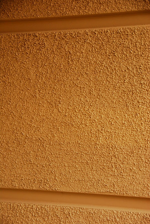
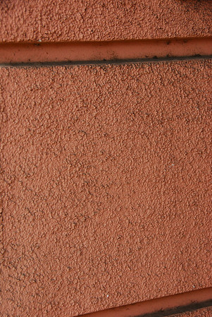
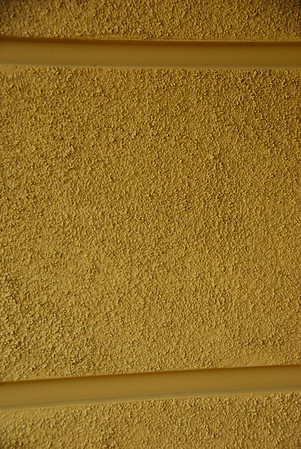
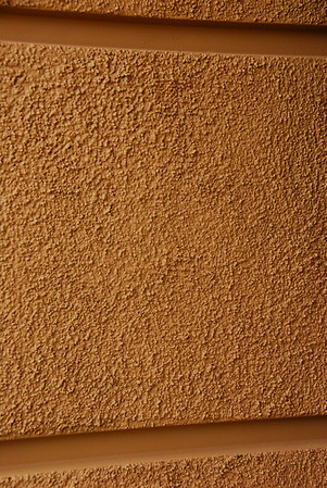
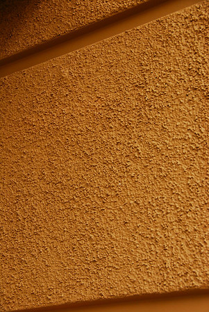
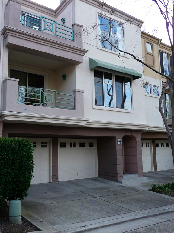
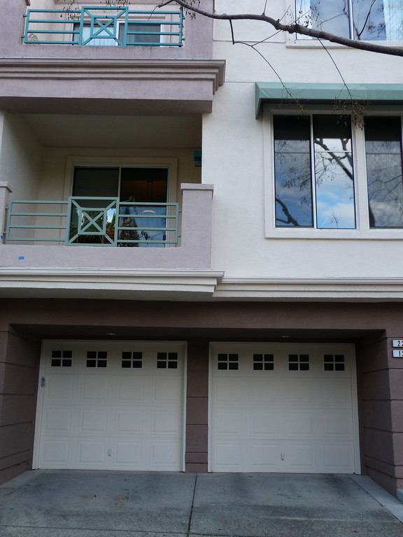
The updated earth tone.

It was an overcast day when i took these pictures, so the colors don't show up right. I think the olive them has potential but is just not right. The iron railing needs to be another color. Not sure why they painted it the same.
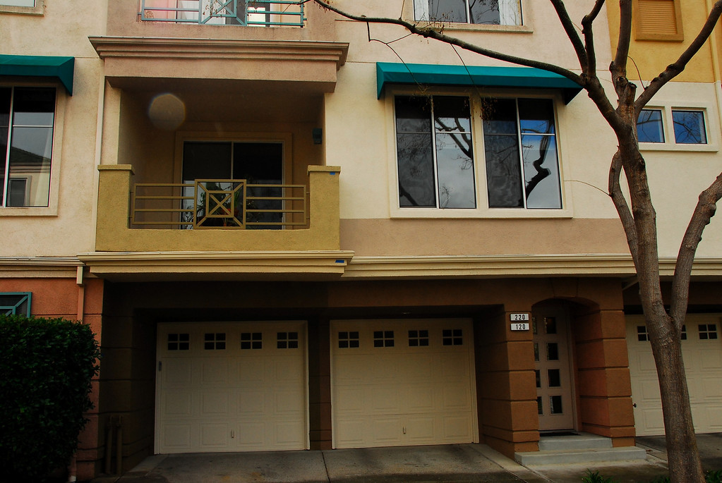
Here are the foundation colors side by side.
Last edited by Admin on Wed Feb 25, 2009 2:40 am; edited 1 time in total
Admin- Admin
- Posts : 685
Join date : 2008-04-02
Location : Building #475 -
fresh paint in original colors
![]() john Wed Feb 25, 2009 2:31 am
john Wed Feb 25, 2009 2:31 am
By the way, each of the test walls at 450 was painted differently, I assume the final run is to paint all units in the same color scheme, right?
My 2 cents continued.
- John
john- Posts : 19
Join date : 2009-02-21
Colors and choices
![]() AlexB Wed Feb 25, 2009 12:51 pm
AlexB Wed Feb 25, 2009 12:51 pm
From some of the discussions, it sounds more like we are asking people to come to us with color choices, so it is not surprising that we get suggestions that look like everything else out there today. If we want to distinguish ourselves, and I think we do, then I agree with those that say we shouldn't just look like everyone else in the neighborhood. I think we can still stay with the Mediterranean (I love spellchecker features!) look, but change the color scheme, if we wish. I do think we should take into account the green of the roof and courtyard colors, as the graphics designer(s) mentioned.
Shouldn't we be directing the painters towards colors, and not the other way around?
The main features I see in the Mediterranean pictures are that the job looks like it was done with more care and attention to detail - each raised/changed window/door area has a contrasting color, even if it isn't a large contrast. Where our paint samples do this, it looks amazing. For those that are worried about how it affect our sales prices, take a look at this. I think you'll find it really makes a difference. To me, it says "we care about the details and maintenance of our home and community" almost as much as the color choice.
As a contrast, if you go into the courtyard where I live (465), for example, you'll see areas where the paint was thinner from last time and areas where it still looks OK. You'll also see how it will look like one giant wall if the awnings are removed and how the areas around the windows will look darker/dirtier over time anyway - so we might as well paint them a little darker...
Here's my color 2c worth:
One of the reasons I purchased here was the lighter, more cheerful colors (8 months ago), even though I'm not a big teal fan - must be some childhood phobia in there somewhere - the other colors would certainly look better after a paint job as people point out, but I'm not attached to them.
I do like that the lighter combinations, but think a brighter color on the awnings and railings would contrast nicely with the other colors. It also seems to match more what I've seen in the Mediterranean pictures people have shown me in the past. It keeps the current look, but doesn't mean we have to fixate on the past.
Don't ask me to help choose a 'brighter' color, though, as I was the guy standing out with a riotous blend of colors in his tea mug - I've also had people challenge my color sensibility...
I do like the direction the lighter paint colors are going in the latest samples, and I think they look better in person, so I encourage everyone to go look at them. I'm not a big olive-green fan, but then there are hundreds of shades to pick from, and the greens I like are probably not good picks anyway.
My only plea is to keep the garage door frame a light contrast to the darker surroundings. As anyone who has watched me try to back in knows, it is really important that I have those vertical lines ... not that it helps reduce the number of tries some nights ...
Alex
P.S. Shouldn't we keep painting new areas each time? That way, if we never decide we'll eventually get the whole complex painted anyway - sort of San Francisco style...
AlexB- Posts : 7
Join date : 2008-06-13
Re: Building color selection
![]() Admin Wed Feb 25, 2009 1:28 pm
Admin Wed Feb 25, 2009 1:28 pm
My personal opinion is starting to change about the awnings and colors. I've begun handing out cards in the complex to recruit more people to join the forum and give their opinion. I've also been stopping people in the courtyards and streets and asking for their opinion. It seems there are 3 camps.
1. People who want the earth tones so they match the other complexes and believe that these colors make the complex more contemporary. These people feel very strongly that the pink and teal colors are completely outdated.
2. People who want the original colors, who believe that these colors make the place cheerful and make the place look Mediterranean and hate the browns.
3. People who want Villagio to remain Mediterranean-like but without the current pink and teal. These people want lighter colors, close to pink but a different tone and the teal into a shade of green that would contrast nicely and match the roofs.
Admin- Admin
- Posts : 685
Join date : 2008-04-02
Location : Building #475 -
Re: Building color selection
![]() Admin Wed Feb 25, 2009 1:48 pm
Admin Wed Feb 25, 2009 1:48 pm
Admin- Admin
- Posts : 685
Join date : 2008-04-02
Location : Building #475 -
Building Color Selection
![]() H. Wed Feb 25, 2009 3:25 pm
H. Wed Feb 25, 2009 3:25 pm
The colors in the pictures are just ugly. Who wants to live in a building the color of mud? Also, it would clash with the stones in the courtyards.
I live on the lower level, and I really like the awnings. They are so pretty with the balcony railings and make a nice contrast to the salmon of the building, and they shade the windows so the sun doesn't glare so much on a bright day.
The entire effect is so tranquil that I leave my shades open nearly all the time just so that I can see it. Everyone who comes to visit remarks on how nice everything looks.
I can't imagine that the colors are "outdated" - whatever that means - or that they'd lower the property values. Seems to me that looking pretty much like every other complex would lower the values. Ours is different as well as being attractive. It reminds me a little of San Francisco, which always gives me a little thrill when I see all the pastels.
H.- Posts : 78
Join date : 2009-02-25
Re: Building color selection
![]() bm455 Wed Feb 25, 2009 5:39 pm
bm455 Wed Feb 25, 2009 5:39 pm
Please don't change it.
By reading the notes on this topic, it seems that the majority would prefer to keep the original colors. Should be cast a vote?
bm455- Posts : 2
Join date : 2009-02-25
Re: Building color selection
![]() H. Wed Feb 25, 2009 9:55 pm
H. Wed Feb 25, 2009 9:55 pm
Let's go back to the original colors, please! If you look at the poll, that got as many votes as anything else.
About the awnings - they do provide a very nice shade; and when it rains, it makes a wonderful sound. I just wish the upstairs units had them, too.
Helen
H.- Posts : 78
Join date : 2009-02-25
Re: Building color selection
![]() Admin Wed Feb 25, 2009 10:17 pm
Admin Wed Feb 25, 2009 10:17 pm
As I was handing out the cards with the forum address, I showed it to any homeowner who would talk to me.
If you'd like to see it I can be available tomorrow at 5:30pm in front of the painted buildings.
Admin- Admin
- Posts : 685
Join date : 2008-04-02
Location : Building #475 -
Re: Building color selection
![]() lucky72 Thu Feb 26, 2009 5:00 pm
lucky72 Thu Feb 26, 2009 5:00 pm
 These are SO VERY outdated! I agree alot with Deborah's input. We need a facelift and a lighter nice neutral color palet would look great. The pictures also don't do the colors justice, so you have to take a look yourself and not rely on what you see in the pictures. The lighter neutral colors are much more pleasing to the eye. It would make our complex stand out and still give it that warm welcoming feeling. As for the awnings, I've never really noticed them (except that awful teal color), so if they were removed I really wouldn't mind, not to mention, it would save a bundle! Just my 2 cents.
lucky72- Posts : 12
Join date : 2009-01-20
Location : Building 465
Re: Building color selection
![]() allison Thu Feb 26, 2009 11:37 pm
allison Thu Feb 26, 2009 11:37 pm
allison- Posts : 4
Join date : 2009-02-26
Window Awnings
![]() TD Fri Feb 27, 2009 2:06 am
TD Fri Feb 27, 2009 2:06 am
TD- Posts : 27
Join date : 2008-08-22
Lowering our Home Ownership Expenses and GARAGE DOOR COMPANY
![]() bradham Fri Feb 27, 2009 2:25 am
bradham Fri Feb 27, 2009 2:25 am
ALSO- Met a gentleman, Andy from America's Choice, of San Jose. http://www.justgaragedoors.com/san_jose.htm. A GARAGE DOOR COMPANY.
He was installing a Lift Master (which is what I have), in a one car, oversized to fit three vehicles, garage.
The company is familiar with the location ( mounted on the side) of the motorized garage box and its installation.
bradham- Posts : 14
Join date : 2008-04-24
Age : 58
new pictures
![]() Admin Fri Mar 06, 2009 9:06 pm
Admin Fri Mar 06, 2009 9:06 pm
here are some pics...
The color expert felt that this would be close to what we have but not exactly the same dated colors, plus be Mediterranean.
What are your thoughts?
Admin- Admin
- Posts : 685
Join date : 2008-04-02
Location : Building #475 -
terrychr- Posts : 42
Join date : 2008-04-25
Page 2 of 4 • 1, 2, 3, 4 ![]()
» New building color options
» New color choices for building painting - includes new poll
» HALLWAY PAINT ACCENT COLOR ?????
» Deck Refinishing Schedule
|
|
|